Kaliber84
-
Posts
565 -
Joined
-
Last visited
Posts posted by Kaliber84
-
-
I'm quite fond of the revisions that I made. The spearhead should be less pronounced and in turn the anchor should be more recognizable as a symbol. The harpoon is in the place which the anchor "handle" would usually be to reinforce the anchor in the image.
Next up would be finishing up and fine-tuning.
- The harpoon will get a second hook
- The spearhead might see minor reshaping
- The anchor will be fine-tuned
- The proportions of single elements (especially line width) will be adjusted to feel more consistent
Any other ideas of how to improve this?
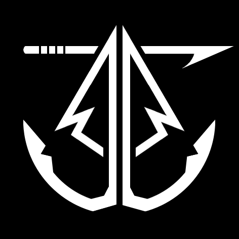
PS: Many thanks to the fabulous suggestions by @Kitsurubami and @Wormas who made this design possible.
") Wormas likes this
Wormas likes this -
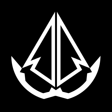
New Bandits logo in a look that should fit the other icons so far. This is only the first sketch and especially the proportions will undergo more changes. But it should provide an idea of where I am going with this. The lower anchor part will be complemented by its respective top anchor part spanning out of / from behind of the spearhead. I still need to figure out how to make that look good though.
What do you guys think of this? What things might not work even when the design is fully fleshed out? What could be added or left out?
My greatest fear so far is that it won't look recognizable for the faction. But I feel that will improve when the anchor part is complete.
-
On 6/27/2018 at 3:14 PM, samsim100 said:
Why not editing the logos together to represent the franktions? Aburning seven pointed star or a frozen leaf would look pretty awesome.
It would look pretty awesome but it wouldn't be easily recognizable as it doesn't represent the faction well. Bandits are way closer to Fire in their style rather than Shadow as almost every style element in Bandits can also be found in Fire. Thus the star would hold no meaning for Bandits, whether on fire or not.
On 5/4/2018 at 5:09 PM, Kitsurubami said:
I love the logo suggestion but I played around enough that I find it impossible to make this into something that is as simple as the other logos.
EDIT: I will be using a stylized spearhead like the one from the Bandit Spearmen and an anchor for now. Still subject to change though.
-
@Archeon That actually helps a lot. Thx for the input.
@steezy I do not plan to make any further changes to the Fire, Frost, Nature, Shadow and Stonekin logos. The badly fitting colour scheme for Twilight has already been brought to my attention and the other colour schemes have been exactly the way you suggest from the beginning. All icons I have posted so far have been created solely by me but some have been inspired by suggestions made in this thread.
The size of the icons is 4 x 4cm at 300ppi or 472 x 472px. You are free to post your own icons. -
@Treim It would definitely be possible. I'd probably build upon my current upload and expand the roots so they fit the primary shape of the biohazard logo. Also I'd need to adjust the eye shape and pupil size.

-
I'm back again. Had some stuff to do and interestingly I did not notice new posts in this thread.

Thank you all for the constructive criticism. I love that you simply want to help me create better icon.
@Archeon @Necrospaz What exactly do you think makes it feel different?
@Wormas Thanks for the sketch. I might incorporate elements of your suggestion into an overhauled icon for Twilight, once I find what I can do to make it feel similar to the other symbols.
@Kitsurubami I will go with a simplified version of your latest entry. It is very well made but I feel that it is actually too detailed for a small icon. Also the composition is a bit too much on the sailor-side for my taste. But I think it is a great foundation and I will play around with it to see what works. Thank you.
Edit:
@Kitsurubami So I played around a bit but I can't come up with anything better fitting than your sketch. The problems with your sketch for a small logo are still present though. My new idea was to simply strip it down to it's bare bones. That would mean the only thing remaining would be 2 crossed harpoons connected by a piece of rope.
That should be still recognizable as Bandits while also being more minimalistic. Similar to the other icons. -
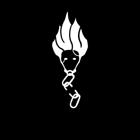
Twilight is finished. One more to go.
From the 2 colored versions I prefer the second one more. I will probably use these symbols in monochrome though, so whatever.

 Przemek likes this
 -
Not sure about the skull but the harpoons are an amazing idea! Thx
-
Update
Finished Stonekin. Also colorized Stonekin and Lost Souls with a dual-color scheme. Looks much better imo.
I might rework Lost Souls when I'm finished with the other symbols.

-
Update
Finished the Lost Souls logo I'll be going with for now. Looks better in monochrome though.

-
Simple is indeed what I am looking for. But I'd also like to use existing motifs already found in the factions if possible. The pure faction symbols aren't that hard to create/find.
Color schemes are actually things I want to avoid. Logos I want are ones that are also recognizable in black & white.What I really need is something for the mixed factions. They have existing motifs but most of those are also used by other factions and are thus unusable to me.
Here is the logos so far. Next up is Lost Souls. Bandits, Stonekin and Twilight still need convincing ideas.
Edit: Added Fire symbol


 Dodotron, Dallarian, BurningWorld and 3 others like this
 -
Nice work. The detail on the coffin is actually a bit much but I'll combine a simplified version with a couple of escaping souls. Should do the trick.
-
The Windweaver bow looks good as a reference.
For Bandit or any faction at all I won't use skulls. They are simply too dominant a motif for Shadow, Lost Souls and Bandits. Thus I can't depict a single faction using them.
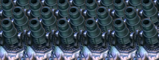
I thought of using either 2 crossed hammers (Banditos, Amok) or maybe a stylized cannon (Corsair, Gunner, Artillery). Those ideas aren't perfect though.Twilight doesn't seem to care for any symbols at all and relies solely on the color palette. That's quite a problem. The Willzapper is not good enough imo but I thought of it too.
But I might try to create a parasite plant thingy. Similar to the small spawn buildings, looking a bit like a virus.The coffin is a nice suggestion for Lost Souls. If possible I wanted something that shows the resurrection aspect of Lost Souls. This might be a way to do it.
For Stonekin I might combine a stone-shield with the grimace on top. I hope that's still intuitive enough.
Maybe I will simply build upon the current Magma Fiend symbol for Fire and reshape it. I need it to be more Flame and less Fiend if you know what I mean.
-
The snowflake symbol is wonderful. Many thanks
23 hours ago, Kitsurubami said:Nature had a repetitive tiki mask theme going on with their buildings, the one that I find most iconic is the one used on the healing gardens and stranglehold but there are many to choose from.
Fire used what looks like a stylized symbol of a magma fiend on the banner of glory, termite hill, and on the sails of the Spitfire.
I see how those symbols are quite common in the Factions but I feel like they don't suffice. The tiki mask is actually also the Amii edition symbol for example (and not that intuitive imo). And the magma fiend might be recognizable but I'd like to avoid monsters in the symbols. I want to keep the symbols themselves as neutral objects/beings.
Currently I think Fire will most likely receive a stylized flame or explosion. My favorite for Shadow is still the encircled, seven-pointed star (see Portal Nexus or Stone of Torment). Nature, Stonekin, Bandit, Lost Souls and Twilight still lack ideas/suggestions. Thanks for your help guys.
PS: What do you think of a tree or a single leaf for Nature?
-
I am currently working on a brand new logo for the community channel.
For that I want to incorporate symbols of every (playable) faction. While I would've thought that there are existing symbols I can't find any.So in short now I need new symbols for every faction and I am asking everyone in the community for ideas, advice or even sketches. If you have any suggestions please let me know and I will see if I can use them.
The symbols should be simple, intuitive and representative of the faction. Ideally anyone would be able to draw a symbol in a couple of seconds. And even without color someone else could recognize the faction it represents.For example a 7-pointed start enclosed in a circle would probably be recognized as
 and is easy to draw.
But a spiral might not be recognized as even though it is a common motive in many nature cards.
Thanks for any and all input!
-
Big update! Added categories and player amount.
@bazzacah Magicka certainly does count. It has a campaign that is dedicated towards playing coop and does not actually focus on multiplayer (PvP) at all. Except for teamkilling which is the most fun you can have in some coop games.

Anything that has a campaign or a (major) gamemode dedicated to coop can be considered a "true" coop game in my book. It really depends on the time you can play PvE with friends and the amount you have to interact with other players. For example something like Bulletstorm is not a "true" coop game as it only features small gamemodes for coop to play around with. Not like Splinter Cell where you get a whole campaign. I do not consider most MMOs to be "true" coop though. While they are mostly PvP, they often encourage PvP, but more importantly they require you to intensely interact with more human players than your group of friends throughout the game. This holds true for most MMORPGs and MMOFPS. MMOs could also be considered a category of their own.
Warframe is an example that is afaik solely coop-focused though. -
On 19.6.2017 at 1:34 PM, Eirias said:
Actually, a lot of Nintendo's "epic orchestral" music is fantastic, although I have to say imo, #1 is FE and #2 is LoZ
Yeah Nintendo got great stuff. I love to listen to the Super Smash Bros. soundtracks as they tend to pick the creme de la creme of their games.

While not being similar to game or movie scores in the recent past I loved to listen to Camel while playing.
They are a genre of their own so just give it a listen. -
I did not really want to get involved in this but I feel that there's a real simple solution to this whole thing.
Just let everything be as is and take a step back. There is no need to know who started what anymore. Pointing fingers won't help anyone at this point so I'd suggest to just let bygones be bygones.
And that is something that anyone who was involved in this whole thing should take to heart.@YT Tobbezockt You won't 'mend' your reputation or position in the forums with a discussion about your behaviour. Who you are perceived as only matters on your actions, not only now, but especially in the future. There is no need to be friends with everyone on the forums and even I have had 'less-than-constructive' arguments with people on here. But that doesn't matter in the long run.
I know that you can take criticism and use it to improve your work. Or to take it and do something else anyway. Whatever you did or didn't do only matters right now. In a month the whole thing will be forgiven by some and forgotten by most people. Just take that opportunity and put aside anything that you still want to ask or explain. When the smoke clears you will find that anyone can change their opinion. Whether that opinion is formed by your arguments, your personality or your work only depends on what you present.PS: I strongly support
 stand on this. Personally I am surprised that no measures have been taken yet but I guess that comes down to how many people took part in this for better or worse. My only hope is that anyone feeling involved will reflect on the rational points made in this argument and especially reprimands. Some might think they are meant for a specific person but they hold truth for anyone in this thread.
-
If there was a soundtrack to your life which band would play it? And which album of that band most accurately fits your life right now?
Rules:
-
You are only allowed to name 1 band and 1 album
- I know you want to name more but we don't want to make the thread into a TL;DR
- Either the lyrics or the general feeling can fit you
-
Prioritize accurateness over personal preference when choosing between 2 bands
- If you are happy and content with your current situation then Nirvana won't be very fitting
- Just because it should fit you, you should still love that band
Let me start with "The White Stripes". Currently my life is somewhere on "Icky Thump" randomly switching tracks.
I love the soundtrack but some of the lyrics can be tough to experience in real life.
But even though some things are lacking overall I'm happy where my life is going right now though.
-
You are only allowed to name 1 band and 1 album
-
2 minutes ago, MrXLink said:
We also mentioned in the start of the alpha phase that additional benefits would be unlikely as we simply can't offer a whole lot more. Any advantage over regular players would be out of the question; as would providing this through Patreon, for example.
...
You will reflect this on Discord as well as the forums, and even within the game itself.
I never wanted an advantage nor any benefit besides from being acknowledged as an alpha tester. To me that doesn't only mean a badge on the forums but also to be taken seriously when I post something. During the course of this project I have gathered a lot of experience regarding both the game and especially the community. For me, seeing that respected means being acknowledged.
All that I ask of you is to not make the development cycle into a 'pay-to-talk-to-the-devs'. You guys talking with any- and everyone, taking their suggestions and feedback is what makes this project more than just BattleForge or SkylordsReborn but into a community. I just hope this won't change.Seeing you say our status will be reflected is nice though.
-
4 hours ago, Eirias said:
....Seems to work for me?
You're right in a sense. When testing a new post it works for me too. But when writing long posts it's not reliably working for me. Sometimes it will redo everything, sometimes only part of it and sometimes not work at all. Can't recreate the bug reliably so I don't know why it happens.
-
I know this isn't really a beta bug but there is no other subforum I could post this in.
So when writing text I tend to use ctrl+z to undo things that can be tricky to fix otherwise (like unexpected layout changes). I also use this when writing posts on here but the behaviour is completely unpredictable and for some reason permanent. Usually one can use ctrl+z to undo the last thing one did and ctrl+y to redo the last undone step (if there are any).
But when quoting somebody earlier I wrote for ~15min and then used ctrl+z, wanting to undo one thing but instead my whole post was reset to the point I was at 14min earlier. Not wanting to rewrite the whole darn thing I gave up. Also ctrl+y does not work at all so there's no workaround either.This isn't any priority for the game but it's awfully annoying when writing here. I would really like to see this fixed or at least to have ctrl+y working.
-
There's another purple dot in Germany
-
@Ladadoos leave the bug for now. i need to level
Faction symbols
in Media
Posted
Long time no see but I am back yet again to pick up the project once again. And this time I hope I will finish the last 2 symbols (Bandits & Twilight) before university swallows me up completely.
I wasn't satisfied with the Bandits logo from my last post as I felt like it had too much of a maritime flair but no hint towards the desert and sun that is so dominant in most Bandit motives. So the idea was to incorporate the sun into the logo and simplify the existing structures.
For this I have sketched out a new logo that uses the harpoon as the central pillar instead of a crossing arc. The sun then supposedly completes the circle of the anchor and combines both maritime and desert aspects with this. I know that especially given the sketch it does not feel the way I just described but it's just a temporary sketch to build upon.
The main problems are:
Any suggestions are appreciated")