
SilenceKiller99
-
Posts
854 -
Joined
-
Last visited
Posts posted by SilenceKiller99
-
-
2 hours ago, Rakkhot said:
What is (or was) this club pengiun thing? Never heard of it.
never heard of it either, but to me it seems a habbo-hotel game (never played that either... but I know what that is)
-
Lol never heard of any of this

-
Someone knows if he is still here? I mean... It was a year ago he posted that. @Czechmate23 Are you alright?
* He last visited the site about 40 days ago.
-
This discussion has happened before, I think. It basically comes down to the fact that the Skylords Reborn team has to make a decision, and whatever they will decide; there wil always be people who do not agree or are not happy. The difficult part for the SR team, though, is to find a balance in the two obvious solutions (grinding everything, like Shotty wants, or getting things quickly, like Rakkhot would like).
And the decision making will be partially influenced by the general opinion of the community, so it is good that people, like you two, are letting them know how you think about it!
-
@Kiwi, do you know if the Skylords Reborn team already decided when the poll is going to close?
-
11 minutes ago, FailsWithTails said:
Also, SilenceKiller99 mentioned a pokeball, and now I can't unsee the resemblance.
Sorry...

-
This is actually a hard decision. I feel Cyrix's is the best now, but poorjoghurt has a lot of potential. If only the text would be more visable and the dark shape would be slightly oval instead of round (so it wouldn't look like a pokeball), then I would vote for Poorjoghurt's one
-
@Kiwi, I cant see who voted on who. Are we not allowed to see this, or is it the bug again?
-
I voted @CyRiX, Simply because Poorjoghurts' text is very bad readable and Lukaznid's is missing the 'reborn' text...
I like the 'mini logo' that Poorjoghurts made though, maybe Cyrix can make one of those too in his art style?
Edit: I made it sound like I didn't like Cyrix's one but chose it because I didn't 'like' the others. That's not true, I really like Cyrix's artstyle and the details like the birds on the left and right and middle, and the dark clouds and light blue on the top and the bottom
-
Why is there an emoticon after every single sentence you typed?
-
@sylvix95 I am not a fan of the blue letters, cause they are not as readable as the orange. But... those flames with leafy patterns inside look absolutely awesome!
-
Wow... @PooRJoghurT and brother, really nice done!
I really like that it is different from the rest. The text in the second picture could use some more color (or detail to make it stand out), but except for that a really nice input. One of my favorites so far.
-
2 hours ago, Yellow said:
Here is my current process. I am not sure about it and want some feedback.
As u can see i am toying around with the Idea to fuse "OR" but i am not sure. They could also be just red and blue and appear twice. Also i need feedback to all the Letters.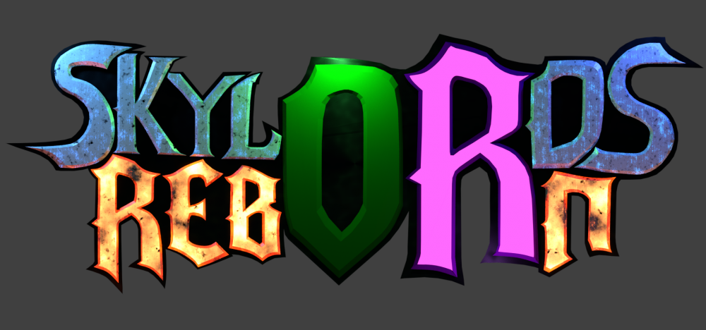
I dont know about the OR part, the idea is really good but it just doesnt look right. Maybe if you try it in some other ways...
For the rest of the letters: The red letters look really good, like they are molten lava or something, or iron being forged into letters. The blue ones however are 'meh' in my opinion. They look like the red ones but just recolored. Maybe you can make them look a bit more like water or ice? (on that note, maybe you can also make the O with some leafs/vines and the R with some shades of ghosts or skeleton bones or something).
Careful tho, such 'theme letters' could easily get to overdone or busy for a logo
-
+1 for that juggernaut. a true piece of art! 10/10
-
guess what... Spearman!!
But also shaman, windweavers, werebeast and swiftclaw. (basicly just nature T1 units)
-
I think this card should be buffed. I mean... simply no fire-nature or twilight player in PvP will every play two nature orbs... because its just to shitty.
It is worth to play fire T3 for gaintslayer, it is worth to play frost T3 for silverwindlancers, koboldtrick/shieldbuilding, and it is worth to play shadow T3 for banditlancers, soulhunter or ashbone...
But nobody will pick nature T3 with twilight/fire nature deck... nobody says 'lets go fire-nature-nature to play enlightment in 1vs1 pvp, or build a wheel of gifts...' maybe fathom lord makes it a bit better, but why wouldn't you just go fire and use gaintslayers?
Buffing this card (and maybe some others) might encourage players to go double nature
-
11 hours ago, Djpingu said:
Here is my Logo, I hope you like it
")
1. Logo (the real one)
2. Logo (reduced)
The Colors, Size and other things are changeable of course.
What is that thing on the o of reborn? It looks like a mini crocodile with a big head xD
-
Very nice!
-
whahaha lol, go stone shards!
Probably a slightly larger influence is amazon passive, get 50% increased heal for all forestkin. So if you combo it right and you had a amazon in T1 (which is possible, because of PvE), you can have larger heals.
This will not really occur in PvP, as combo's suck there and T4 generally is a bad idea.
(This has really small affects on the game overall, but I thought I just mention it...)
-
Nightshade plant, the Swedish version of grimvine!
But, as @Mental Omega said, it is bad compared to Abomination. I also don't like the ability, cause a fire/nature deck has access to heals, so you should try to keep it alive... Even though more twilight units have an 'on death' ability, like slaver.
*Note: Nightshade plant is a forest kin destroyer, while Abomination is a beast destroyer. This can play a role in certain buffs and negative effects. In which I think forest kin are favorable over beasts.
-
And the last reply was like exactly 1 year ago, also on the first of December... xD @Ultrakool that is no coincidence, right?
-
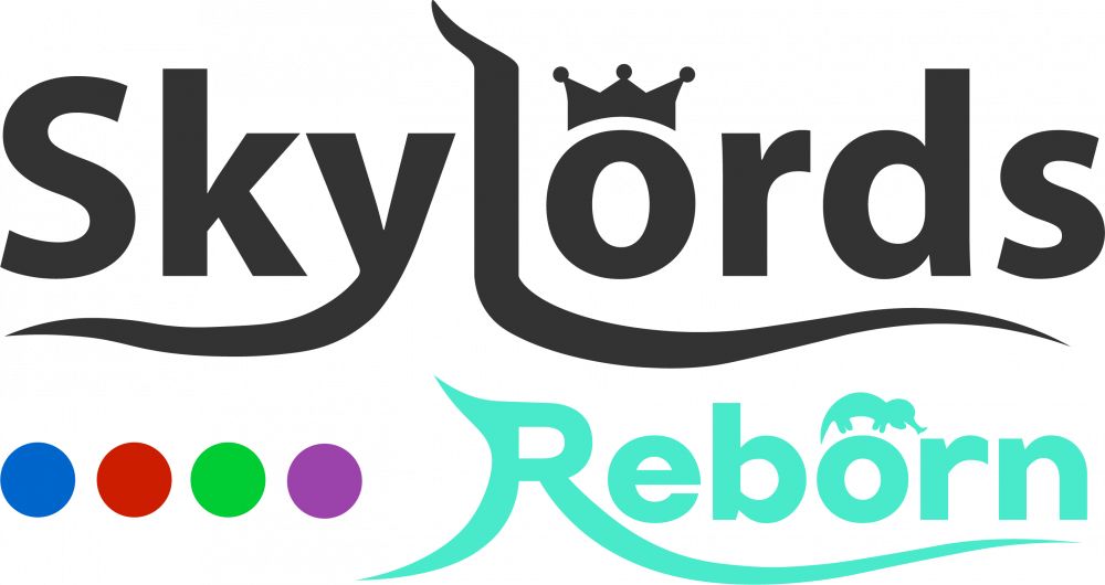
20 hours ago, CyRiX said:
My entry for this contest. Hope you like it.
I really like this one! Only the font of that D and B... that is a little less good in my opinion. I think this is the best one so far. Because it represends clouds and it just has a battleforge vibe to it... (only that D and B tho...)
-
Some of them are really useful and I didn't know them, like Ctrl+Shift+T in chrome if you accidentally closed a tab, or Shift+Esc to see what tab is eating all of your disk speed, or F6 to copy the URL cause some long url's are hard to select (if you drag it will take a lot of time and if you doubleclick it sometimes only selects a single word or something)
-
*I deleted my logo because others are far more beautiful or professional looking*

Official Stream Incoming! (11/02/2017)
in Announcements
Posted
It sure was!