-
Posts
1429 -
Joined
-
Last visited
Everything posted by Eirias
-
Using the European servers, right? Unless it's a Tavern Brawl, or we only use starter cards, I'll decline since i have no cards.
- 58 replies
-
- Community
- Hearthstone
-
(and 3 more)
Tagged with:
-
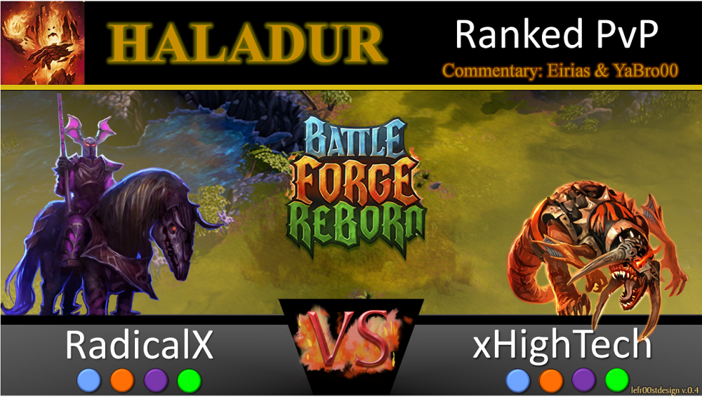
Alright, first thumbnail on a video is here:
-
I'm happy to help If you want advice on Pure Fire, I'd suggest @Dawn. I'm good for Fire-nature (Dexirian as well) and @Darian DelFord is the strongest pure nature player in beta (as far as I know). In order of general skill, it's Dawn>Me>Darian. I'm also happy to answer any deckbuilding questions (although there are a lot of other people on the forums who can do that) and I'll spar with you to show you why certain options are poor if you disagree with the established meta. I'd also appreciate it if you read the fire-nature section of my deckbuilding guide, because I put a lot of effort into that . But remember, Beta is primarily for testing, not playing .
-
actually, FrostAvatar made some nice ones for me But if you want to see how Lukaznid's looks, scale it to 225% and see the resolution.
-
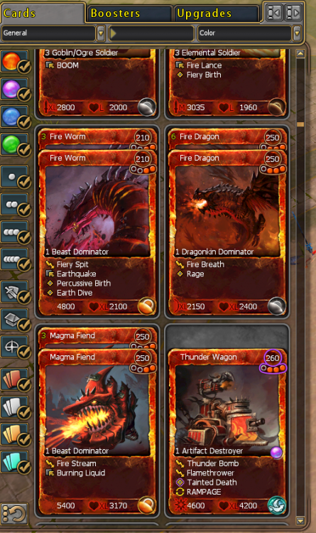
NAME: Ranged symbol on most fire cards not appearing SEVERITY: 3-purely cosmetic LOCATION: In the card pool (on the left of the screen, opened by clicking the tab) REPRODUCIBILITY: Always DESCRIPTION: The ranged attack symbol for fire creatures does not show up in the cards list. There is one exception to the rule: Fire Dragon. I don't know if that is because it is card specific, or if the ranged attack symbols for S, M, and L are missing. Once the card is added to a deck and hovered over, the ranged attack symbol appears clearly. SCREENSHOT/VIDEO: ADDITIONAL INFORMATION: Other players do not seem to have this bug I don't know why it wouldn't let me upload this in the previous post, but here's the screenshot
-
@Lukaznid could you do magma hurler next?
-
So anything else to adjust, in your opinion? Is this as good as it gets
-
I guess it was the blending method. Idk, but the most recent frost and shadow one that you posted looks really bad at large scales. I generated my own again, trying to make them look more 3D. Is this any better?
-
oh, okay. Well, I guess they'll have to do. Forgot fire? And the first shadow is higher resolution than the second
-
Could you scale them to 225%? I'm guessing you won't lose resolution because you generated those yourself?
-
What's stopping you from directly taking them from a card? And what are your suggestions to make the VS screen 3D?
-
We tried that, it didn't look very good. Personally I'm quite happy with the black trapezoid. @Lukaznid what exactly do you mean by making the VS screen 3D? Making the letters have a more 3D effect, or the trapezoid? Did you ever redo the sunstrider? Or are you working with @lFrostAvatar through PM?
-
You mean so the jaws of the scavenger go over the border, while the legs go under? that's not a ton of work, but it may double the time spent making the thumbnail. If you make more 3D looking orbs (or photoshop crop them out of a card?) I'll use them instead of the simple circles!
-
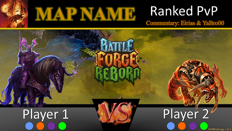
Well, I aligned the creatures by hand, but that trapezoid in the middle and the text boxes for players 1 and 2 should be aligned pixel-perfectly. So I guess that means it's the BFR Logo.
-
What does the map look like?
- 15 replies
-
- conquer lyr
- strategy
-
(and 1 more)
Tagged with:
-
Big thanks to @lFrostAvatar! Here's what the thumbnail will look like now: Any thoughts? Is the BFR logo too small? How do the orbs below look?
-
@lFrostAvatar I'm not sure the flames on the scavenger really stand out, but the one on the dreadcharger looks really cool--like a shadow. I think using the same color "flames" for all the units would be good. I looked at the thumbnail in a reduced size, and the text on top is a bit small. Could you make the banner on top a little bit bigger? (and what if it was black?) If you blend one half of the background purple, and the other half red, it makes it difficult to change unit avatars. What if you just blended both sides to black? (and yes, I'm a big fan of the magma hurler there )
-
Yeah, so no I could work the thumbnail into an intro somewhere, but I kind of like having the same intro that I don't have to mess with. And with the map, as long as the name is on the thumbnail, I really don't think it's necessary to have an image. @lFrostAvatar Personally I think the background is better the way it is, so there's probably no need for a "real" map (although perhaps a background that corresponds to the map at hand, like a snow background and a desert background)
-
Yeah, that's a good point. Perhaps the small map in the corner should be made larger and fill the center of the screen (then you can do away with the background and have special effects behind the characters?). While the balancing looks really fantastic right now, perhaps you should show us the thumbnail-sized versions for judgement? There's no way to see thumbnails in YT at full size, is there?
-
Looking even better! I'm not sure if the facebook, youtube, twitch, and twitter symbols add anything. I wonder if "Haladur" could go all the way to the right, and centered in some kind of box (like the players' names). I really like the fade to red! I wonder if it would look better if you fade to black or dark purple though... (or special effects behind the characters, I'm also interested in what you've got in mind there ) Keep up the good work! Oh, and what's the #1 and #2? And I don't think you need to include the players' rank. That would get too tedious to keep track of, I think. But I really like what you did with the orbs!
-
Well, I meant like different shades of white, black, and gold. So not completely different colors, just slightly different so that you know they're not all the same. But perhaps just changing size/font is enough
-
Well, it hasn't been said here, so just doing my part to keep up the hype
-
@lFrostAvatar That looks great! How does it look if we switch the places of "VS" and "BFR?" And maybe use a different font for Day IV and Haladur? Or what if the map name (in a different color font? Maybe gold in a black box?) goes where BFR is now, and BFR goes to the top of the screen, sort of overlapping with the border. Then all of the "setting" info could go at the top (Example: Opening Tournament: Round IV: Game 1: Haladur, possibly in different fonts, sizes, and colors). Also, what if the images of the units moved toward the center a little bit, and there was a black (vertical) bar where I could put the orbs (so room for 4 spots). I really like the background you have there (and the map in the top left is a nice touch). My only real complaint with it is that it seems a little busy on the left, and it's a bit hard to distinguish between the background and the dreadcharger. I wonder if there's any way you can increase the fade to white (or even black?) in such a way that the units pop out a bit more? Or you could even do like a solid color triangle that sort of splits the scene (so it divides the screen into 3 triangle--2 solid colors where the units are, and 1 upside-down that looks like it does now. The boundary would go from the top left corner to the bottom center, to the top right corner). But idk if any of that would look good. Just some suggestions! Oh, and can you include somewhere to write "Commentary by:" ? Thanks!
-
The fan art contest ended. Remember what they said about the end date for that? "When closed beta is ready...."
