
lFrostAvatar
-
Posts
65 -
Joined
-
Last visited
Posts posted by lFrostAvatar
-
-
Just now, Lukaznid said:
that was the plan
")
@lFrostAvatar glad you posted them on imgur, they really are the best for albums and such IMO

Yes it is indeed, thanks for the advice on that regard.
I hope your Cutouts getting now a new glance with that resolution -
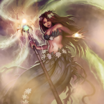
Hello everyone!
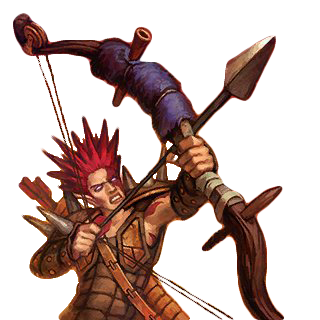
I rendered together the last couple days dozens of original battleforge artworks to a better resolution thanks to @Perendi.
You can find them in the links below:
All Albums
Units (Shadow)
Units (Fire)
Units (Frost)
Units (Nature)
Units (Twilight)
Units (Bandit)
Units (Stoneskin)
Units (Lost Souls)
Units (Legendary)
Miscellaneous Artworks
Buildings (Fire)
Buildings (Bandits)
Buildings (Frost)
Buildings (Legendary)
Buildings (Twilight)
Buildings (Lost Souls)
Buildings (Shadow)
Buildings (Stoneskin)
Buildings (Nature)
Spells (Nature)
Spells (Shadow)
Spells (Fire)
Spells (Frost)
Spells (Mixed Fractions)
Reworked Artworks
HD Artworks
BFR Backgrounds
HD Loadingscreens
Also because some people asked me about the backgrounds that I am using for my thumbnails, I am using this ones right here :
Screenshots
If you are going to use one of these artworks, make sure mention my work.
If I am missing some artworks in the current existing albums let me know, in that case I will add them as quickly as I can.Hrdina_Imperia and Dallarian like this -
On 12.9.2016 at 10:04 AM, Lukaznid said:
Sure I'll do it today sometime
Suggestion. I would've left the starting screen, the thumbnail, on the screen a bit longer so people could actually see it and read it.
E: done, one with 75% transparency on the flames, one without, chose whichever you like better
transparent
 and solid
I am currently not on my computer, but when I come back I will render this Hurler for you, give me a day or two.
Also I might be able to provide tomorow my album of rendered artworks, so you can pick the rendered versions and work with them instead.
Another thing, you said recently that you want to toy around with the thumbnail.
The template will be available pretty soon, I will upload it right into this thread!
Make sure to check it out then! -
Just now, SilenceKiller99 said:
Sad to hear you are feeling ill, I hope you feel better soon!
Nice changes, specially those flamy things look awesome, you should do that with every unit xD
If would like to see those other backgrounds, I like them a lot. If you would like to share them, I can use them as desktop backgrounds.
Thanks for the feedback man.
Sure I do have more of those, I dont know if they are viable for backgrounds though.
I will send them to you per PN. -
Aight thanks for the feedback i really appreciate it.
I wasnt able to respond so quick because i am sort of ill hope you understand that!
Made some Changes based on your concerns.
I optimized the size of the orbs, also you can see on the left side that i left the tierslots by removing the previous orb icon, it looks maybe awkward but when I stick to the idea I will convert it with better quality.
Tell me your thoughts on it!
As for the effects, I made some rough flames behind the dreadcharger and scavenger.
Also i made a change regarding the background, on the left side i added more darker elements whereas on the right side sort of orange burn.
The last thing i changed was the BFR logo by increasing the size.20 hours ago, SilenceKiller99 said:@lFrostAvatar where did you get that background? and are there more like those?
Yeah i do have more of them, made them back when Battleforge was still playable.
19 hours ago, Eirias said:And with the map, as long as the name is on the thumbnail, I really don't think it's necessary to have an image.
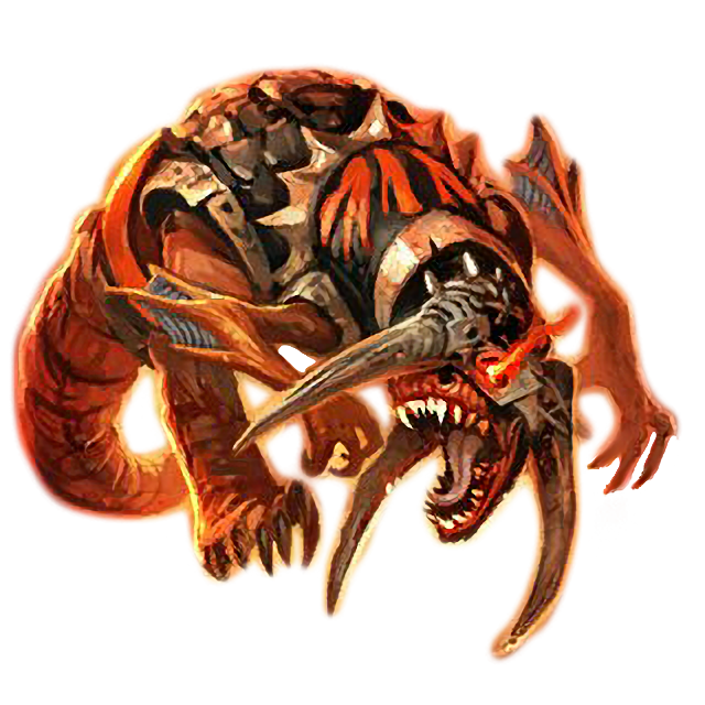
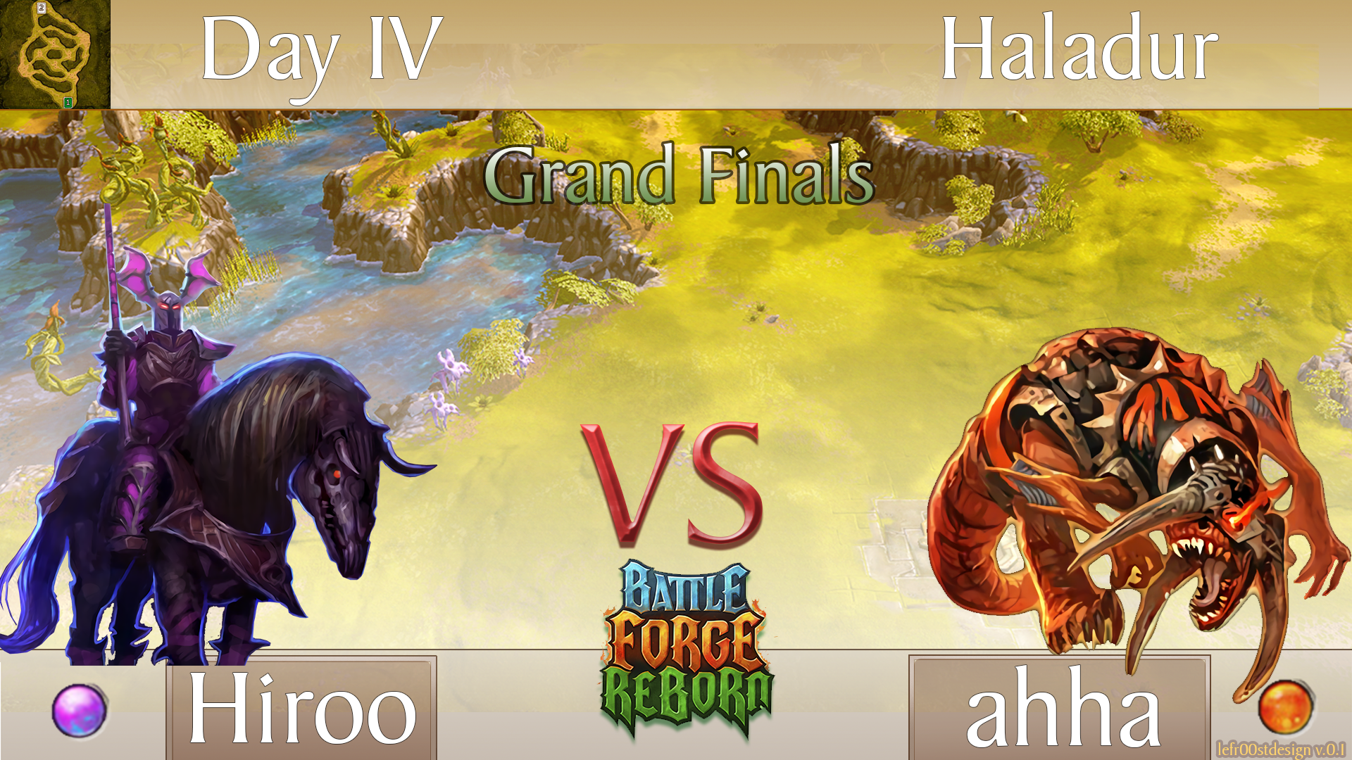
Added instead of the Haladur Map now your Magma Hurler, hope you like it that way!
-
38 minutes ago, Lukaznid said:
Hmm, I think I'll cut them out, or leave a bigger outline.
Make sure to send me the new one then
38 minutes ago, Lukaznid said:Other than that, if they're not from google and of higher quality then yeah sure gimme
Aight i will send them to you with a PN.
You can present me the cutted pictures in a PN as well, would appreciate it! -
Just now, Lukaznid said:
I get it 100% enjoy
")
No I meant for the image cutouts. I mean you already did the dread charger as a .png file so I don't have to, I was wondering if you did any other cards, no need to rediscover hot water right? (aka. redo stuff)
Also here's a sunstriders one ready for rendering.
 I'd left some of the red and yellow pixels out on the side, should I remove it?
Oh i dont have him as PNG, i deleted the white things later :/ didnt noticed that.
For the sunstriders, I will render and check if the red and yellow pixels wont be detrimental.
And yes i did some other cards, but didnt cut them out.
Still wanna have them ?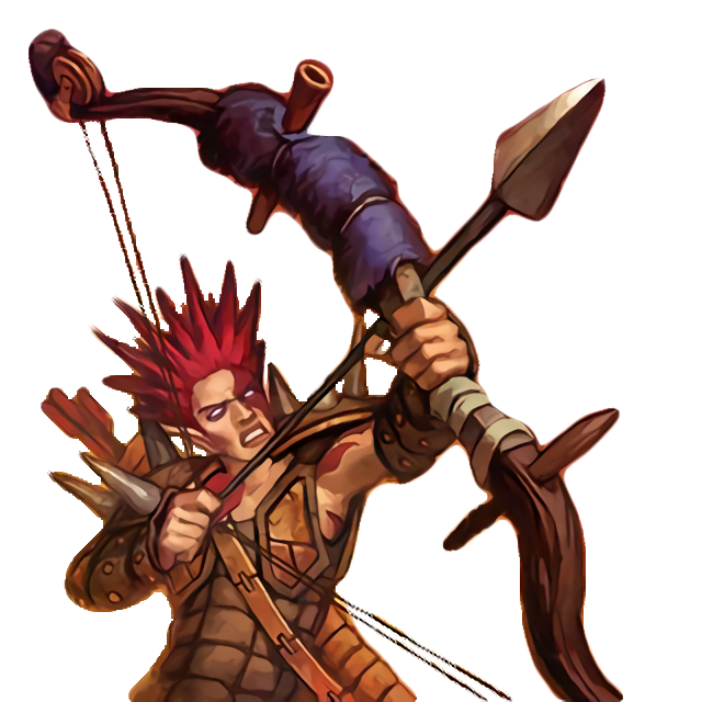
-
1 minute ago, Lukaznid said:
Do as you wish, I thought we were working together but if you want to do it by yourself that's fine by me. Also I see that you've already made the dread charger, mind sharing which else you already made so I don't have to?
You got me wrong mate i am not rejecting your help, but for the current state i want to progress alone, hope you understand that.
The fact that you provide some feedback and criticism is already a help.
For the dreadcharger, you can have him of course, I will let you know if i render some other cards.
-
5 minutes ago, Lukaznid said:
Also are you doing this is photoshop? If so could you send me the .psd file so I can toy around with it a bit?
Yes i am working with photoshop, yet i wont share the source data.
I will share the source data later as template for ppl to change names etc.
But for now i am still working on that, i hope you understand that. -
2 minutes ago, Lukaznid said:
neat, I'd add some effects behind the creatures based on what affinity they are and swap the shield and orb on the right so its symmetrical
Actually i thought about adding some effects behind the creatures, I just get the feeling that it is too much then.
If i do that, I can cut the whole background out because it wont even matter anyways.3 minutes ago, Lukaznid said:swap the shield and orb on the right so its symmetrical
Sure i can do that.
-
Aight @Eirias new version is done, hope you like it :)!
Tried to optimize some points that you mentioned.
Also added some purple colour on the left side and some red on the right to blend in better with the monsters.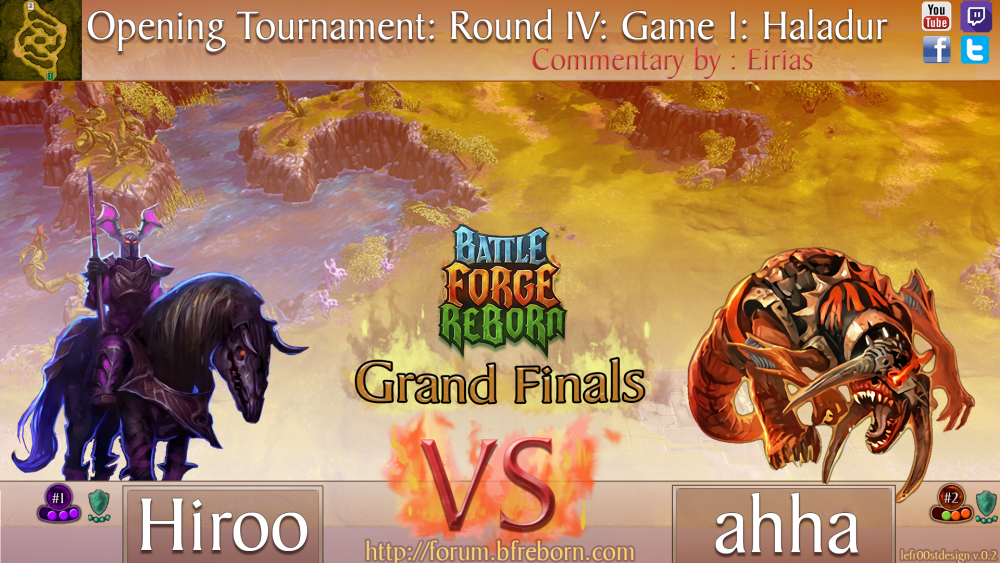
-
Just now, Eirias said:
Well, I meant like different shades of white, black, and gold. So not completely different colors, just slightly different so that you know they're not all the same. But perhaps just changing size/font is enough
Well, i am trying to progress now step by step, showing you version after version.
So i can focus precisely on one aspect that isnt perfect, to make it flawless.
That said, the next version might not inlcude the changed font, but i am fixing now another problem that you mentioned, make sure to behold the new version soon! -
37 minutes ago, Eirias said:
That looks great! How does it look if we switch the places of "VS" and "BFR?" And maybe use a different font for Day IV and Haladur?
Or what if the map name (in a different color font? Maybe gold in a black box?) goes where BFR is now, and BFR goes to the top of the screen, sort of overlapping with the border. Then all of the "setting" info could go at the top (Example: Opening Tournament: Round IV: Game 1: Haladur, possibly in different fonts, sizes, and colors).
Also, what if the images of the units moved toward the center a little bit, and there was a black (vertical) bar where I could put the orbs (so room for 4 spots).
I really like the background you have there (and the map in the top left is a nice touch). My only real complaint with it is that it seems a little busy on the left, and it's a bit hard to distinguish between the background and the dreadcharger. I wonder if there's any way you can increase the fade to white (or even black?) in such a way that the units pop out a bit more? Or you could even do like a solid color triangle that sort of splits the scene (so it divides the screen into 3 triangle--2 solid colors where the units are, and 1 upside-down that looks like it does now. The boundary would go from the top left corner to the bottom center, to the top right corner).
But idk if any of that would look good. Just some suggestions!
Oh, and can you include somewhere to write "Commentary by:" ? Thanks!
I will try my best based on your suggestions, give me some time and i will send you the new version
About the Font colours, i thought white works the best.
Since i suppose that it would otherwise look like a rainbow land ;P
-
13 hours ago, Eirias said:
I think @lFrostAvatar can do it. Maybe you can collaborate with him?
I made some Prototype of how the Thumbnail could look like, take a first look.
Any suggestions for this?
-
19 minutes ago, Eirias said:
Thanks a ton! I mean Lukaznid posted a new picture of Master Archers, so can you do that cool rendering thing to them as well? (I'm guessing you can, since you can do it to all of the pictures, but just checking).
So did the masterarchers, hope this is like you expected.
-
7 minutes ago, Eirias said:
I think the first one is better for larger images, so I should probably use that for the thumbnails? I'm still in awe of how you managed to do that, btw. Can you do these for all of Lukaznid's photoshops (including the MAs?
Niiiice
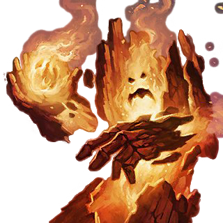
.
@lFrostAvatar That ravage looks amazing
. Saved it in my thumbnails file, even though it probably doesn't make sense to include it in a thumbnail Well, i can do that for all of the Pictures since it wont take quite long.
What do you mean with MAs? can you explain it for me?
About your recent question , i can create this blank pattern for the thumbnail, i will start tomorow with it. -
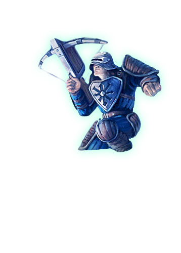
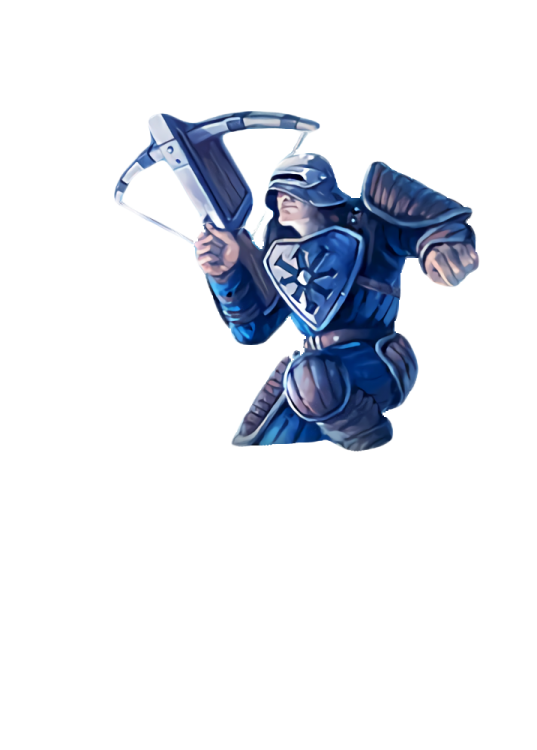
6 minutes ago, SilenceKiller99 said:
@lFrostAvatar The first scavenger one looks kinda cool, the second one is awful in my opinion. I don't even think you can see the difference when its as small as a thumbnail, but I think I like the original better. When bigger size I like that first one of yours better, looks really clean and nice.
Thought so, still wanted to show.
The second one is just simply rendered higher.
Whereas the first one is more smooth.
In pictures like that one below, the renders pays off tbh
Because that bad resolution turns into a smooth artwork that you can properly use for designs or sth.
-
About the glow on the masterarchers, in my opinion you should decrease the intensity of the glow.
Just give it a try, and show me the new result, you can use the rendered version for it! -
3 minutes ago, Lukaznid said:
Why make additional work for myself right?
This is what it looks like if I add it.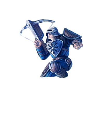
About your question , i dont use any filter, using a render programmed by me and my mate.
-
19 minutes ago, Lukaznid said:
Ok they're not that difficult to make, just be aware that BF art isn't that big pixel wise. It was meant for cards so
 I mean the scavenger is 500x500 or something
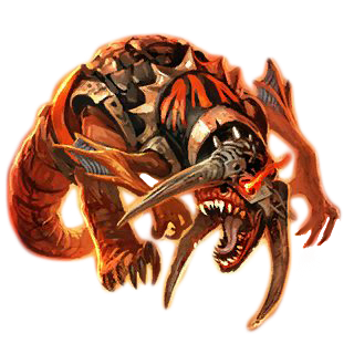 btw too much glow around?
What about these ones ? i took your one and edit it, hope your fine with that.
Guess that would work for thumbnails, got two ones here, as one is easier for the eyes (which might become handy for thumbnails), where the other one is straight up rendered on higher resolution.
What do you think about that?

-
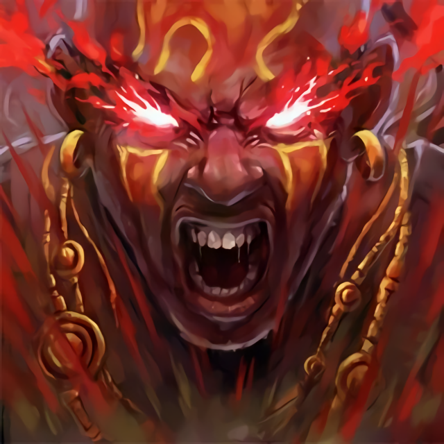
In case they add some new ones I desperately want to see the promo frost avatar with some crazy artwork and quite a mesmerizing ingame model
-
First of all I think the proposal from xlink is pretty damn good , if you behold the fact that we have fair bonuses which will give players good opportunities to be able collecting bfp.
The system have to be balanced for each different type of gamers, such as ppl who have a job and can just barely collect the rewards, but also for competetive players.
But in my opinion players who plays literally 99% more then others dont necessarily needs more rewards, remember that this players are more capable of attempting a tournament to collect additional rewards.
As for a friend bonus you can add a system that will prevents players from adding just ppl in the queue to abuse the system, there should be a thing like if you have this friend one week on your list, you're getting that boost in case you play with him, that would result an not abusive system.
-
First of all I want to introduce myself perchance there are some of you who may know me from the original battleforge, but I assume most of you don't
I'm a 16 year old student from germany and I prefer to be refered as "frost", my real name is Fabian.
Most of you probably can figure out why my Nickname is Lfrostavatar, basically it comes from the Battleforge card "frost avatar"
that has supefied me from the very beginning and it reminded me of my old roughcasted battleforge card.
Battleforge was a blessing, due to its superior and uncomparable graphic standards at the time.
Also it had the most balanced PvE and PvP which I have witnessed since my Gaming experience.
After the Battleforge servers got shutdown I sadly had to find a new game to play, as a fan of Diablo 2, Diablo 3 came in mind
and I slowly but surely got better and better which leads to me as being one of the best nowadays.
But ofcourse it was not comparable to something like Battleforge that had its player made Maps. I still remember Maps such as bad harvest,
sunbridge and many more of Superspitzi and kaldra that were made with such perfection I can barely believe it.
Until the 14th of June I thought "Hey, why is noone actually trying to make a remake or private server of Battleforge".
God Bless the 14th of June, since that day I received the relieving message that someone is trying to get that game back and without the
fear of the servers getting shut down again.
Tl;Dr: It was a perfect game with few flaws that were too unnoticable to be mentioned, I am sure that there is much to come in the future.
As I already said in my presentation, I greatly appreciate the community, and I would like to keep it in a positive attitude, I would be very exciting to work and play with everyone here! -
as dedication for hiroo
[img]http://gyazo.com/410dc53405534d05463927f7dd751026.png[/img]


Battleforge Rendered Artworks and More
in Media
Posted
I am glad to hear that you are using it for your forum avatar!