Scorpical
-
Posts
8 -
Joined
-
Last visited
Recent Profile Visitors
1305 profile views
Scorpical's Achievements
Watcher (1/34)
0
Reputation
-
well with AI you can "redraw" a pixelimg with high photo quality, but the problem is that the gradients will be gone to some degree. On a small img though it's almost not to see that some colourscales are missing. (i peffer ps too) so enought of that...
-
dpi is the standart measurement unit set by most graphic programs, dpi is also used by monitor measurment (even if the designer should say ppi) and yes it's definitly thought for print becaus of the print raster unit, but still the difference between ppi and dpi is for the common guy unkown and thous resulting in the saying "dpi for media is set by 72". and yes you are right it wouldn't lose sharpnes that was my failure of describing with a false word, what i meant is the pixel will be compromised and that will result in loss of pixel wich means that some details might disapear. and no if you resize a small picture from 300px x 400px with 300 dpi to ca. 600px x 800px and with the dpi value set smaller with half the size the picture will not lose sharpness because the pixel will not be stretched but relocated, but if you set a small dpi from the beginning and stretch it afterwards the picture will definitly blur
-
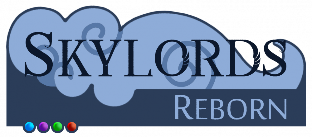
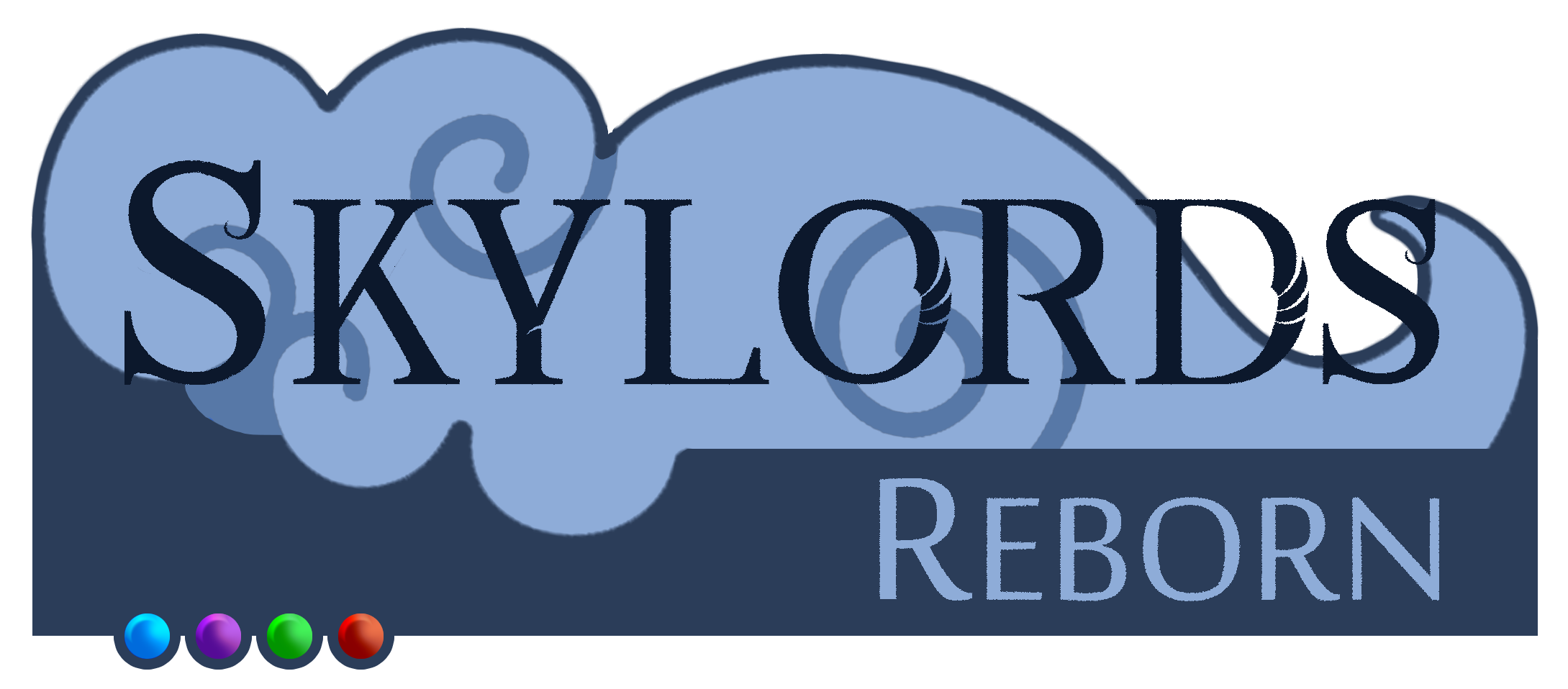
Im just saying, because if you resize the logo from a big format into a low res it will lose sharpness. The reason they didn't need a vector graphic for the logo was because they always had 3 different sizes for their logo, it's a EA thing. They did this by making the small logo into a 300 dpi format and resizing the img with the dpi is almost no loss in quality.
-
I love it! The cloudy effect looks really very nice. Only thing I would personally suggest is switching up the colors, so they are not identical to the old original combination. Other than that, the work is amazing! Nice and simple, and even though it's all "blue", you can read the text without problem - I really like that. The style overall looks very nice and the 4 elemental orb representation adds it a diversity in color as well as makes it more BattleForge-y. All great designs A question: if you want a "high resolution" img why don't you ask for a vector graphic? because the transparency is way better for web format and easier to scale in the code.
-
Guys one thing about free fonts, if you get them from the web like "dafont.com" or something, keep in mind those fonts can have a copyright too, so be carefull about that. just a tip from a design Student
-
the words are barely visible, it would look better if you made them smaler and cut it out from one of the two long bars in the middle of both letter. The backround is to "much" just the letters with the image blended and the backround only with a gradient, would have been enough. but it's still good.
-
but i think yours would still look different, so why not make one?
-
Okay i just made an account for this..